MITISZOL? store design

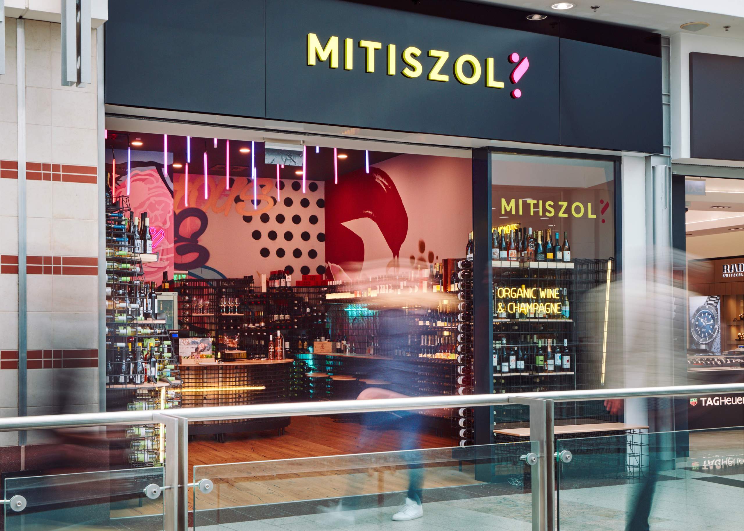
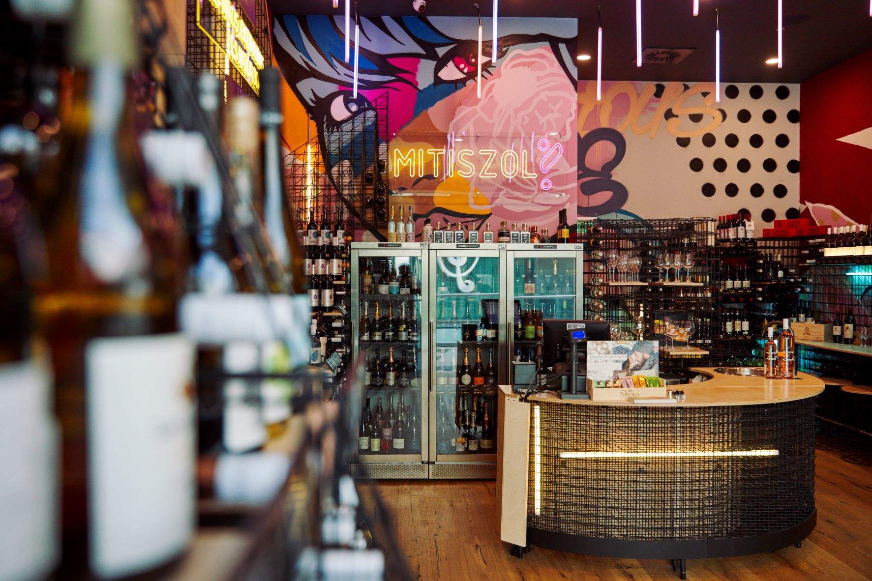
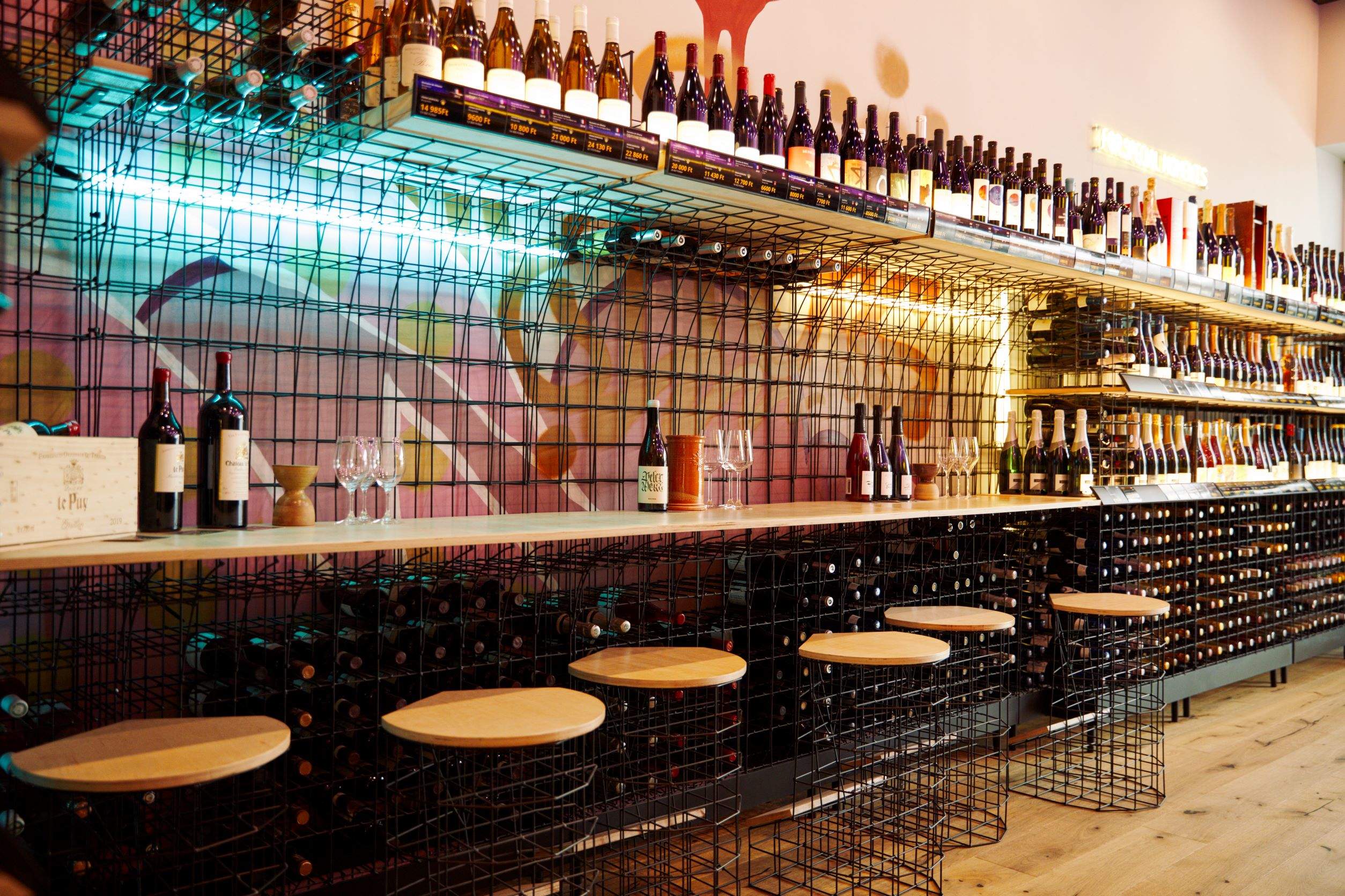
In the spirit of "rebellious" interior design that breaks the classical rules, we used unconventional spatial arrangements, materials, and colors. The organic shape of how poured drinks swirl in a wine glass has inspired the design of the interior’s elements. The installation - which thus looks like it’s rippling along the walls like a huge glass of wine spilled out - connects the three spatial units: the resting area directly in front of the store, the tasting/shop space, and the storage.
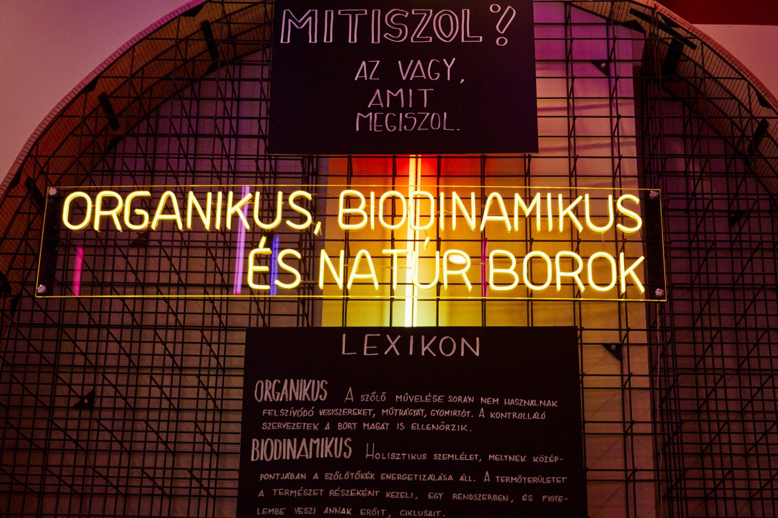
We aimed to integrate all functions within the installation, including wine shelving, counters, lighting, and a bar for tasting. We were looking for a flexible and practical tool to build it, so we chose steel mesh that made it possible to, on the one hand, display the bottles for sale, and on the other hand store thousands more. The mesh has an industrial character that fits the fresh character of the retail brand aiming to connect with a young crowd as well. The interior design of the shop is complemented by striking graffiti on the walls.
| Creative concept | András Huszár, Dávid Ráday, Krisztián Tóth, Péter Oravecz |
| Lead designer | Péter Oravecz, András Huszár |
| Project architect | Ádám Bedrossian |
